Skip to content
00%

Blueprint

The Greene brand in one place. Every colour, file, font and rule here copies with one tap, so it can go straight into your work.

Name
Tagline
Email
Website

Core identity

The marks and the type: the parts that say Greene before anything else does.

Logomark

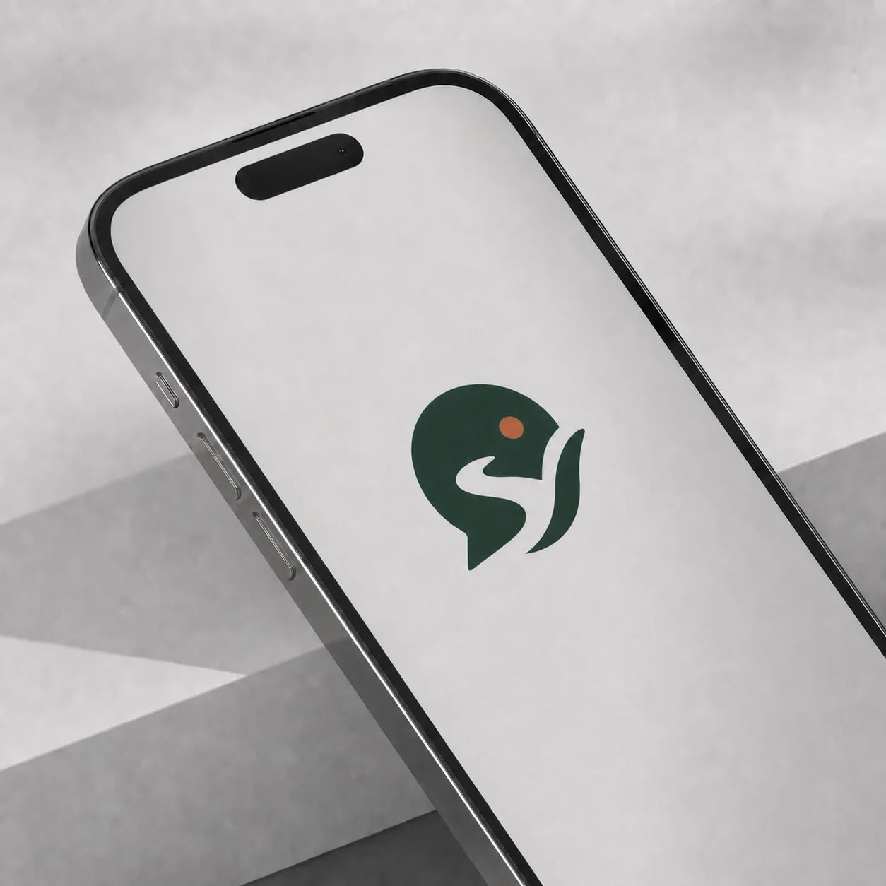
The runner on its own: a symbol that stands for the brand without needing words. Use it where space is tight or the name is already clear: app icons, avatars, favicons, stamps.

Copyright © 2026 Greene Studios

GreenDownload SVG
PaperDownload SVG
YellowDownload SVG

Primary typeface

Montserrat is the one family for everything. It's a geometric sans with a wide weight range, from Light to Bold in a single variable file, so it carries the whole hierarchy on its own: big confident titles, easy paragraphs, crisp labels.

This page is set in it.

Copyright © 2026 Greene Studios
Aa

  • Ag

    Regular

  • Ag

    SemiBold

ABCDEFGHIJKLMNOPQRSTUVWXYZ

abcdefghijklmnopqrstuvwxyz

0123456789

! ? & @ # % ( ) [ ] / : ; , . £ $ € ₦

Typeface hierarchy

Each level has one weight and one job. Copy a row's CSS to set text exactly as the site does.

Copyright © 2026 Greene Studios
Display

SemiBold 600

Design that moves

Hero statements, page and section titles, big numbers

Title

SemiBold 600

Brand identity

Card titles, questions, sub-sections

Body

Regular 400

We design and build brands, websites and apps.

Paragraphs, descriptions, documents

Small

SemiBold 600 / Regular 400

Start a project

Buttons, tags, navigation, captions, fine print

Visual language

Colour, pictures and pattern: how Greene looks once the logo has done its job.

Colour palette

Greene Green and Studio Green lead; Clover Yellow is the spark; Ink and Paper do the reading. Leaf Green lifts the brand on dark pages, and Raw Orange is for loud moments.

Every code copies. The CMYK values are straight conversions from screen colour, so ask the printer for a proof against a swatch.

Copyright © 2026 Greene Studios
Primary brand colour: the logo, links and buttons on light pages

Dark ground: the default page colour

Accent: the logo and buttons on Studio Green

Light accent for dark pages

Text and dark grounds

Light grounds and text on dark

The Raw theme: a loud ground for campaigns

Brand imagery

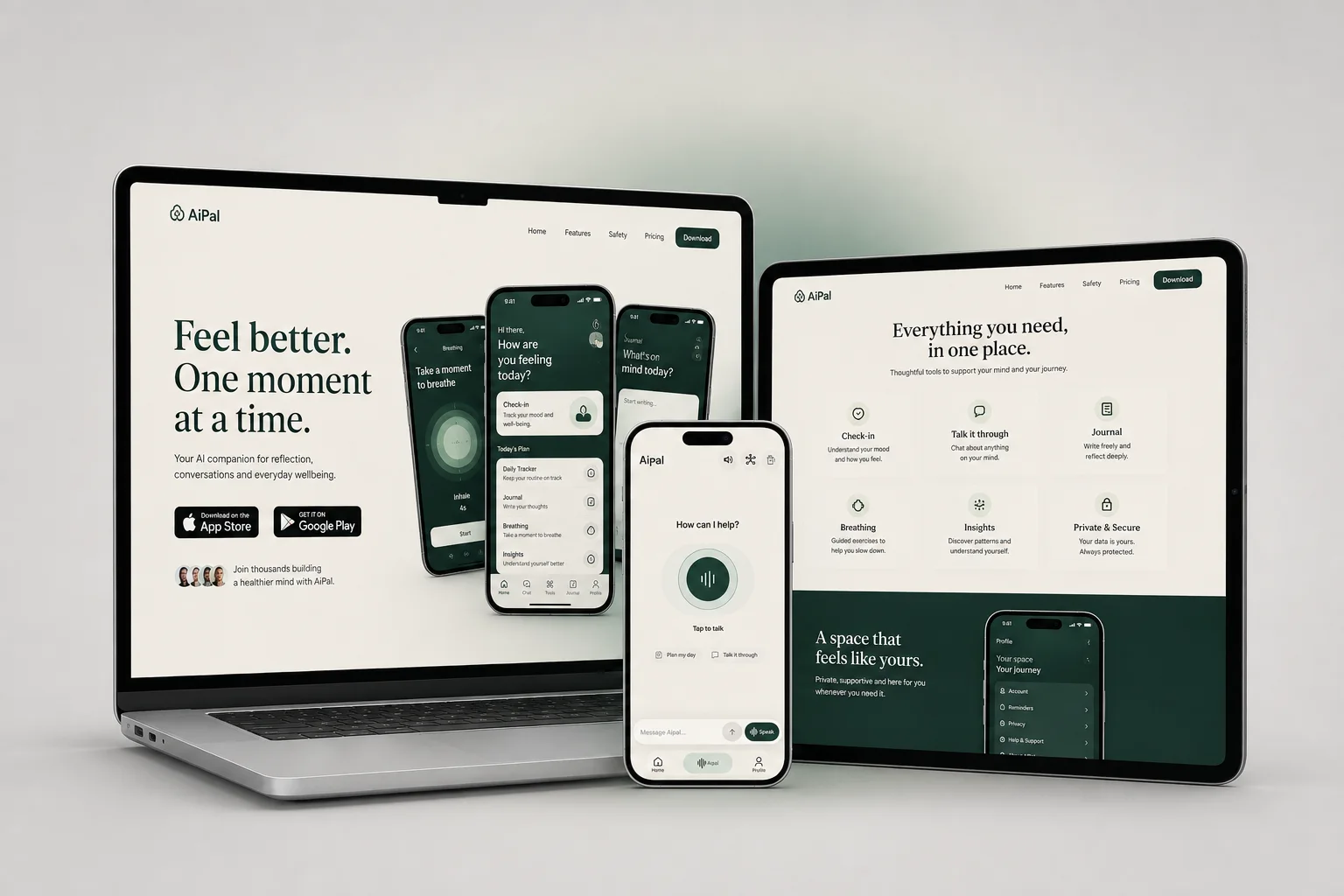
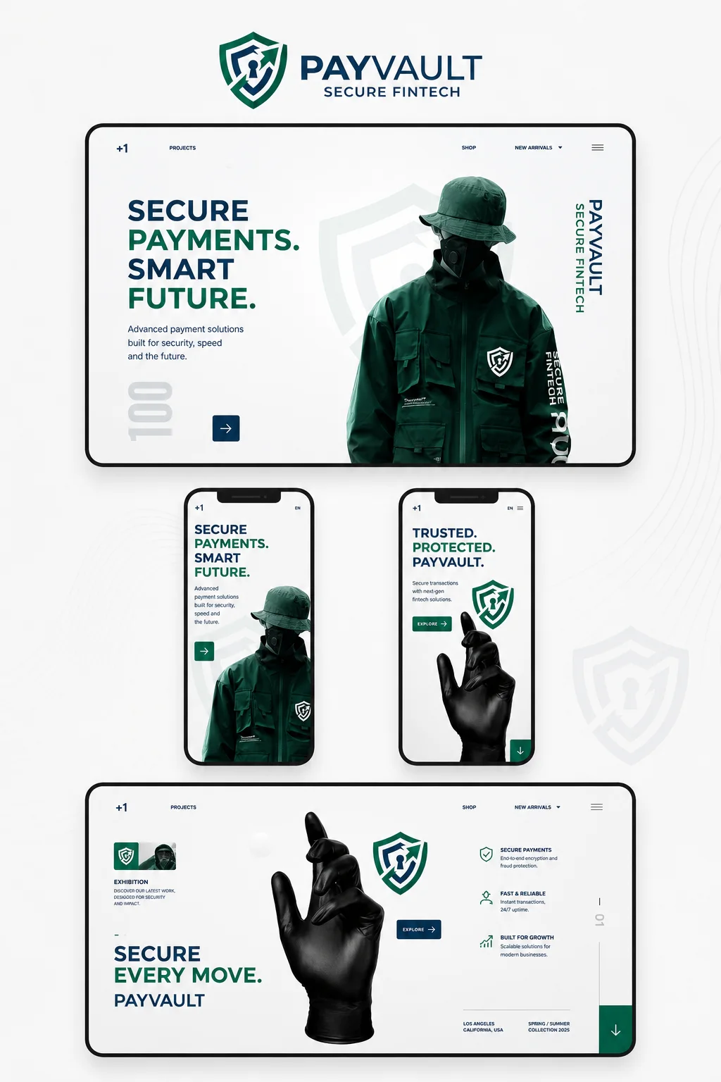
Greene shows real work, never stock: finished products on soft, quiet grounds, with room around them. Devices and screens are shown straight and whole, so the work can be read, never cropped into a shape or zoomed past its edges.

Warm, natural light; calm neutrals; one strong colour at most. The feeling is confident and calm: made with care, ready to use.

Copyright © 2026 Greene Studios
Graphic patterns

The dot matrix comes from the globe at the foot of every page. Use it as a quiet background texture behind headlines or empty space, never behind body text, and never louder than the content on top.

A fine grain sits over the whole site at a few percent; it keeps flat colour from feeling digital.

Copyright © 2026 Greene Studios

On brand colour
On dark

Applications

Everything together, out in the world: on screens, on paper and in people's hands.

Mockups and collateral

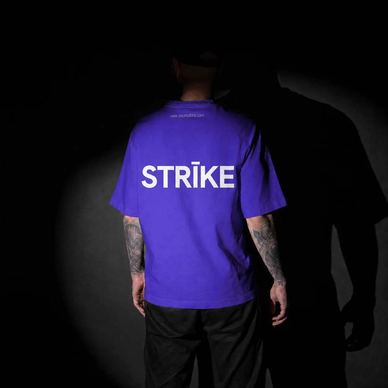
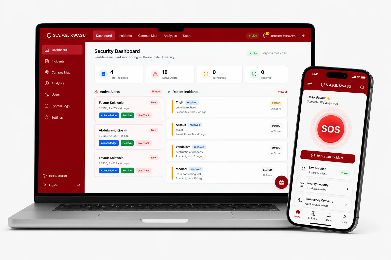
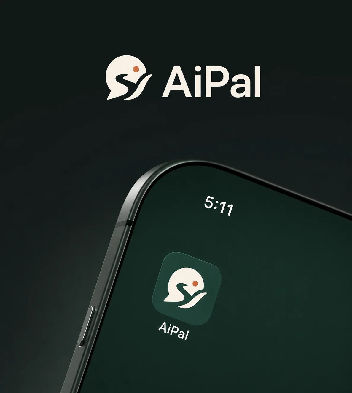
The same few parts every time: the mark, Montserrat, the greens and one picture. Out of doors, keep it to one line and the logo; on things people hold, like the card, let the runner and the colour do the talking.

Copyright © 2026 Greene Studios

We design and build brands.

Greene
Billboard

Greene Studios

Digital Design Studio

hello@greenestudios.com

greene-studios.vercel.app

Business card, 85 × 55 mm, front and back

Digital and social media

Posts pair one picture with one bold line and the mark in a corner. Banners run wide and quiet: the line on the left, the logo on the right, lots of room.

Copy the sizes below when setting up a canvas.

Copyright © 2026 Greene Studios

Greene social postGreene social post

Social creatives

Design and code
under one roof.

Greene

LinkedIn banner

We design and build
brands, websites and apps.

X (Twitter) header